Barcelona benefits from a very extensive underground rapid transit network which currently includes 9 subway lines spanning 118 km (compared with 214 km in Paris, 76 in Taipei, and 63 km in Philadelphia (SEPTA and PATCO)). While I only travelled a fraction of the system on my weekend trip, it was enough for me to develop a great fondness not only for its convenience, but also its architecture.
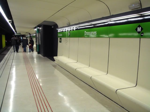
Interestingly, I might not have come away with the same impressions had I visited one year ago, as a good number of stations (including the two pictured in this post) have been completely renovated within the past year. Despite its very recent renovation, Drassanes, pictured above and below, boasts a neat retro-cool space-age futurist design out of Star Wars.
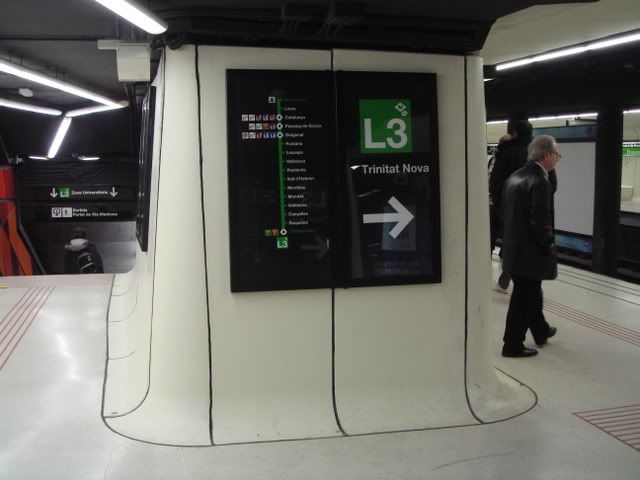
On the more conventional side, Liceu's redesign is particularly artful and refreshing. The platform area is lit by a continuous wall of back-lit white panels decorated with autumn-colored leaf patterns.
For the sake of comparison, I'll finish with a photograph of Liceu back in May 2005 found on Trenscat, followed by one of my own photos taken last weekend.
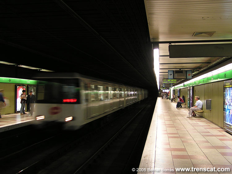
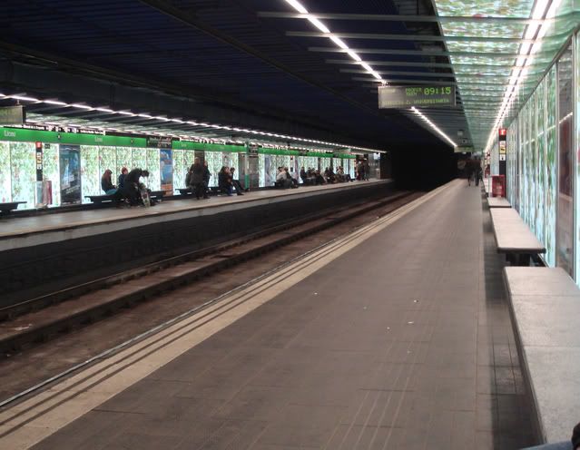
Not bad at all if you ask me. According to the City of Barcelona's news releases, renovations of Liceu and Drassanes cost 2.5 million and 1.8 million euros respectively. Back in Philly, SEPTA is set to receive $190 million in federal stimulus funds in the very near future, and according to Paul Nussbaum and the Philadelphia Inquirer, will allocate $36.7 million of that money for rehabilitations to Spring Garden and Girard stations on the Broad Street Line. Lets just say that when all is said and done, they'd better look fantastic.
SEPTA outlines projects set for federal funds [Philadelphia Inquirer]
Note: Subway line lengths roughly calculated on Wikipedia
Friday, February 27, 2009
Wednesday, February 25, 2009
Then and Now: Librairie Gilbert Joseph, 30 boulevard St-Michel, Paris
c. 1930-2009
The Gilbert Joseph bookstore first moved to the boulevard St-Michel in 1929, and despite its major expansion since then, has continuously occupied its original building. As the main bookstore has moved further up the avenue, the store at no. 30 is now a separate stationery section.
Source: http://www.gibertjoseph.com/GIBERT/fr/help/Help.aspx?id=contact3&group=7
Original Photo: "HRL-520986." Collection Albert Harlingue/Roger-Viollet. Parisenimages.fr. Parisienne de Photographie. 19 Feb. 2009. http://www.parisenimages.fr/Export450/3000/2001-15.jpg
Source: http://www.gibertjoseph.com/GIBERT/fr/help/Help.aspx?id=contact3&group=7
Original Photo: "HRL-520986." Collection Albert Harlingue/Roger-Viollet. Parisenimages.fr. Parisienne de Photographie. 19 Feb. 2009. http://www.parisenimages.fr/Export450/3000/2001-15.jpg
Sunday, February 22, 2009
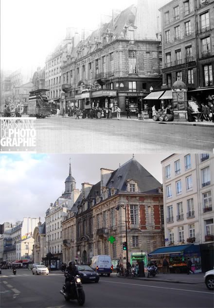
Then and Now: l'Hotel de Mayenne, rue Saint-Antoine, Paris
Wednesday, February 18, 2009
Then and Now: Rue Nationale towards place Pinel, Paris
Rue Nationale, like most streets which cross boulevard Vincent Auriol, exemplifies the extensive urban renewal that took place in Paris' 13th arrondissement in the 60s and 70s. Unfortunately, it has all the defining characteristics of modernist city planning while lacking much redeeming value elsewhere. Its apartment blocks are set back from the street behind plentiful yet inactive green spaces, themselves fenced or walled in from the sidewalk. There is no continuous street wall and very little retail presence, and the rather uninspiring architecture leaves most visual interest here to be provided by generous curbside parking.
Original photo: "LL-2097 Rés." Collection LL/Roger-Viollet. Parisenimages.fr. Parisienne de Photographie. 24 Jan. 2009. http://www.parisenimages.fr/Export450/9000/8466-5.jpg
Sunday, February 15, 2009
Then and Now: Quai des Grands Augustins by rue Gît-le-cœur, Paris
c. 1939-2009
The banks of today's Latin Quarter are just as populated with bookstalls as they were 70 years ago. Just visible on the right side of the photo is the beginning of rue Gît-le-cœur, one of the many locales frequented by André Breton, Max Ernst, and other members of Paris' Surrealist community in the early 30s, as recounted by the Czech Surrealist author Vitězslav Nezval in his charming and aptly-titled memoir, Rue Gît-le-cœur.
Original Photo: "RV-82988." 1939. Collection Roger-Viollet. Parisenimages.fr. Parisienne de Photographie. 15 Feb. 2009. http://www.parisenimages.fr/Export450/18000/17793-2.jpg
Friday, February 13, 2009
FuTai Street Villa (撫台街洋樓), Taipei
The FuTai Street Villa (撫台街洋樓), contrary to what its name might suggest, is found today at no. 26, YanPing South Road (延平南路) in Taipei's ZhongZheng district, one of the main thoroughfares of the city's colonial-era hub. According to the City's Department of Cultural Affairs, the structure was completed c. 1910, and housed offices and a storefront for a Japanese liquor boutique. The building's design presents an exceptional juxtaposition of 19th century French villa-inspired composition with a sidewalk arcade typical of vernacular commercial buildings in Taiwan. It also seems to be the only colonial-era structure that remains on the street.
Its immaculate appearance however, hides a fairly turbulent history. Following the end of Japanese occupation, the property was seized by the Nationalist government's Ministry of Defense, and mostly left vacant for half a century. It was not until 1997 that the FuTai Street Villa was designated historic by the city government, launching a historic preservation battle with the Ministry of Defense that would last nearly a decade. In 2002, the building fell victim to an act of arson which caused most of the upper floors to collapse (though its masonry was thankfully salvable, along with its building plans). As if that were not bad enough, the Ministry provoked greater anger and legal opposition when it attempted to auction off the damaged property.
Ultimately, the preservationists emerged victorious, as reconstruction and renovation of the damaged structure began in 2006, presumably under the auspices of the Ministry of Defense. Work was completed in early 2008, and the building has been designated as the future site of the Taipei Film Center (台北攝影中心). As to how far those plans have progressed, I am yet uninformed.
Note: If anyone is more informed about this building than I am, please correct me since I might very well have misunderstood something during the course of my research.
Sources:
1. http://www.culture.gov.tw/building/view.php?vid=948&page=
2. http://www.tonyhuang39.com/tony0530/tony0530.html
3. http://www.odie.idv.tw/Taipei/FutaiStreetMansion.html
Tuesday, February 10, 2009
Then and Now: 100-104 W. Lancaster Avenue, Ardmore
(I realize that this entry, started way back in December, is somewhat overdue. But alas, better late than never.)
The squat, brutalist building at the corner of Lancaster and Ardmore Avenues sometimes referred to as the Smith Building (whose history I haven't yet been able to find) was unceremoniously demolished by Lower Merion Township sometime around early December. According to a Township news release from last year, the building is to be replaced by a reconfigured intersection with a widened Ardmore Avenue, and a small public seating area.
On one hand, the reasoning is perfectly understandable. The intersection is notorious for being incredibly cumbersome for drivers and pedestrians alike, due to the poor alignment between Ardmore Avenue and the driveway leading into the heavily used parking lot behind most of the north side of W. Lancaster Avenue, built long after the original intersection was. Furthermore, no one really liked the hopelessly outdated and very poorly maintained Smith Building, which probably never gave a good impression to visitors either. I don't know how far construction has progressed, but I'm guessing that work will be completed sometime this year.
In the meantime, I've had some concerns floating in the back of my mind. For one, does Ardmore really need more roadway on Lancaster Avenue? The intersection, like the majority of the avenue, is already harrowing to pedestrians, and I doubt that making it part of it wider will make it any more comfortable. Furthermore, the plaza/seating area will be up against the blank side wall of the adjacent building (though this could be easily fixed with a mural).
Lastly, 30 is a bad age for any building or style of building, and the Smith Building, which I'm guessing was built in the 70s, is no exception. Buildings as ugly as this one are hard to come by on the Main Line! Yet, as inconceivable as it is to us, late 19th century Victorian architecture was in the 20s and 30s often considered to be just as hideous as brutalism is seen today. I'm also sure that the Smith Building would have looked significanly less awful had it been better maintained. Perhaps a later generation will lament its replacement by a widened road intersection, and see it as a crime against architectural preservation. Or perhaps they won't. Only time will tell.
Ardmore and Lancaster Avenues Realignment Project Moves Forward [Lower Merion Township]
Bird's eye view courtesy of Live Search Maps
Sunday, February 8, 2009
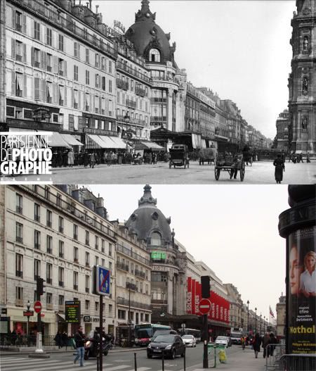
Then and Now: Rue de Rivoli east from rue du Renard, Paris
Original Image: "LL-217 Res." Collection Roger-Viollet. Parisenimage.fr. Parisienne de Photographie. 5 Feb. 2009. http://www.parisenimages.fr/Export450/14000/13927-18.jpg
Friday, February 6, 2009
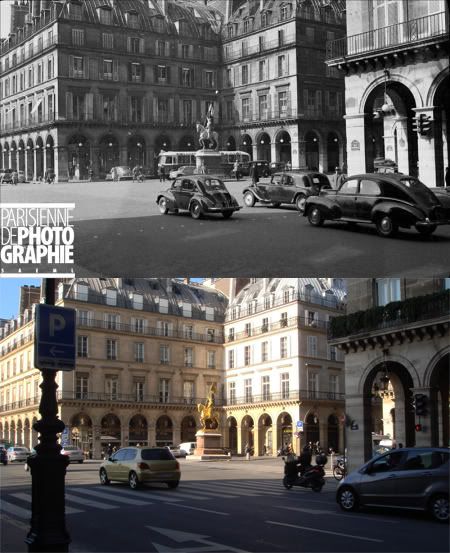
Then and Now: Place des Pyramides, Paris
Original Photo: "PRL-1209." Collection Roger-Viollet. Parisenimages.fr. Parisienne de Photographie. 4 Feb. 2009. http://www.parisenimages.fr/Export450/14000/13392-1.jpg
Tuesday, February 3, 2009
Les Olympiades, Paris
The Olympiades housing complex was built between 1968 and 1974 as the centerpiece of an ambitious urban renewal project that rebuilt much of Paris' 13th arrondissement. The best way of accessing the complex takes a set of steps off of rue Tolbiac in Paris' 13th arrondissement that at first glance does not seem to go anywhere in particular. At the top of the steps, the curious visitor is rewarded with one of Paris' most unique vistas.
Despite the many times I've seen it, the view from the top never fails to be breathtaking. Regretfully, my photos can hardly capture the grandeur of the space, nor the impression of watching towers advance interminably into the distance. It feels much like walking into an outdated Utopian vision - a realized version of Le Corbusier's Radial City, for one.
Though Paris' Modernist planners had much of the 13th arrondissement as their playground, nowhere was their vision as completely realized as it was at the Olympiades project. It comprises multiple housing towers and an indoor shopping complex grouped together by a vast plaza which, in true Modernist fashion, is built roughly four stories above street level on an elevated platform to separate pedestrian activity from automobile circulation and delivery below. The towers are of uniform height, and each given names of former Olympics host cities (London, Tokyo, Helsinki, etc). The Asian-inspired roofs on the plaza's retail buildings also add an international touch. While I'm no fan of Modernist city planning, such a fervent expression of its idealism on a scale unseen in the United States is quite something to behold.
Somewhat unusually for a giant work of Modernist urban design, the complex has a lot going for it, and has endured its 30 years rather well. The crowded indoor shopping center and outdoor plaza are home to a cluster of well-patronized Southeast Asian immigrant businesses that attract a fairly steady stream of foot traffic through the plaza, even in the depths of winter. The plaza's retail spaces run along its main southern axis in a slightly asymmetrical, playful zigzag pattern that seems to entice visitors forward. Though I have yet to experience this, I have a feeling that its small courtyard spaces are rather agreeable in the warmer months.
Subscribe to:
Posts (Atom)